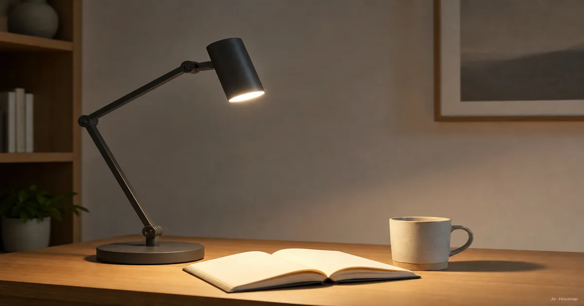
Desk Lamp Color Temperature, How to Pick the Right Kelvin Before You Buy
Most people buy a desk lamp by looking at the shape and the price, then discover a month later that the light itself feels wrong. Too yellow and they get sleepy over a textbook. Too blue and their eyes ache by evening. The number that actually controls all of this is color temperature, printed on the box in Kelvin, and almost nobody reads it before buying. The short version: lower Kelvin is warmer and yellower, higher Kelvin is cooler and bluer. A candle sits around 1800K. Overcast daylight is around 6500K. Your desk lamp lives somewhere in between, and where it lands decides how the light feels to work under. Here is the trap. There is no single best color temperature, only the right one for what you do at the desk. Someone reading a novel at night, someone editing photos, and someone studying for an exam at 9pm want three different lights from the same lamp. So this guide starts with what Kelvin actually means, walks through the three zones you will see on every spec sheet, maps them onto real use, and finishes with the three numbers besides color temperature that decide whether a lamp is comfortable to live with.
Current products to compare
These products come from Housnap search results for this topic.


What color temperature actually means, and why Kelvin is your key number
Color temperature is one of those specs that sounds technical and turns out to be simple. It describes the color of the light itself, on a scale measured in Kelvin (K).
The idea comes from physics. Heat a piece of metal and it glows, first a dull red, then orange, then white, then a bluish white as it gets hotter. Scientists pinned each visible color to the temperature that produces it, and lighting borrowed that scale. The formal version is called Correlated Color Temperature, the temperature of an idealized glowing object whose color most closely matches the light source, standardized by the international color body CIE (Wikipedia).
Here is the part that trips people up. Lower Kelvin numbers look warm and yellow. Higher Kelvin numbers look cool and blue. It feels backwards, because we call yellow light "warm" and blue light "cool" in everyday speech, but on the Kelvin scale it is the opposite.
For practical lighting, the scale runs from about 1800K, the glow of a candle, up to about 6500K, the light of an overcast midday sky (BenQ). Every desk lamp you will look at falls inside that range, and the single number on the box tells you exactly where.
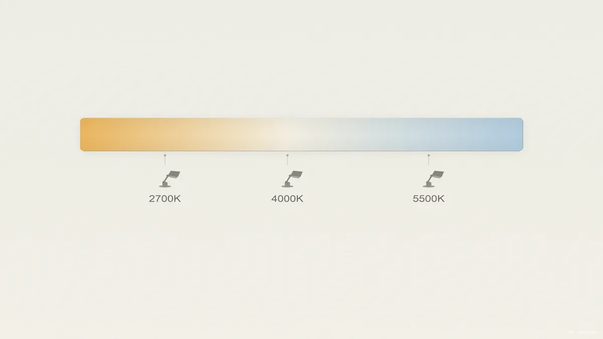
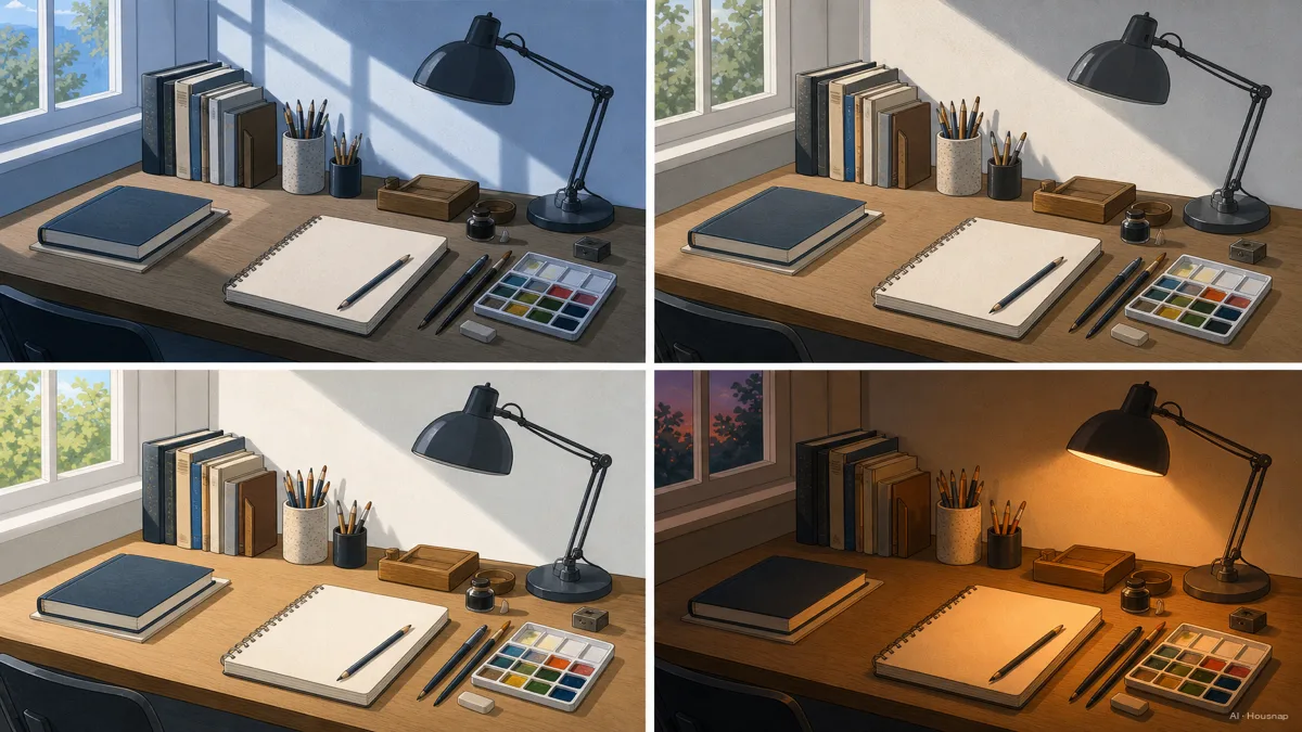
The three main zones: warm 2700K, neutral 4000K, daylight 5000K to 6500K
Spec sheets sort desk lamps into three rough zones. Knowing the character of each gets you most of the way to a decision.
Warm white, 2700K to 3000K. This is the color of an old incandescent bulb, soft and yellowish. It is calming and easy on the eyes, which makes it lovely for a bedside reading lamp or a living-room corner (Feit Electric). The catch for a work desk is that the same relaxing quality can make you drowsy during a long focused session.
Neutral or cool white, 3500K to 4100K. This is the evidence-backed sweet spot for desk work. Around 4000K you get light that keeps you alert without the harsh blue cast of full daylight, and it is the single most recommended color temperature for a home office or study desk (BenQ). If you only buy one fixed lamp and do a bit of everything at the desk, this is the safe answer.
Daylight, 5000K to 6500K. This is bright, crisp, slightly blue light that mimics midday sun. It maximizes alertness and renders colors most accurately, which is why art studios and photo-editing desks reach for it. The tradeoff is fatigue. Extended work at the full 6500K end can tire your eyes over a long day (improveworkspace.com).
A quick note on how your eyes work here. The human eye adapts to whatever color temperature surrounds it, so the difference between 4000K and 6500K is most obvious the moment you switch, then fades as your eyes adjust (RP Photonics). That is exactly why color temperature matters for precision and comfort over hours, not just for how warm a lamp looks in the first five seconds.
Choosing by use case: reading, screen work, art, and evening study
The zones only matter once you map them onto what you actually do. Here it is by task.
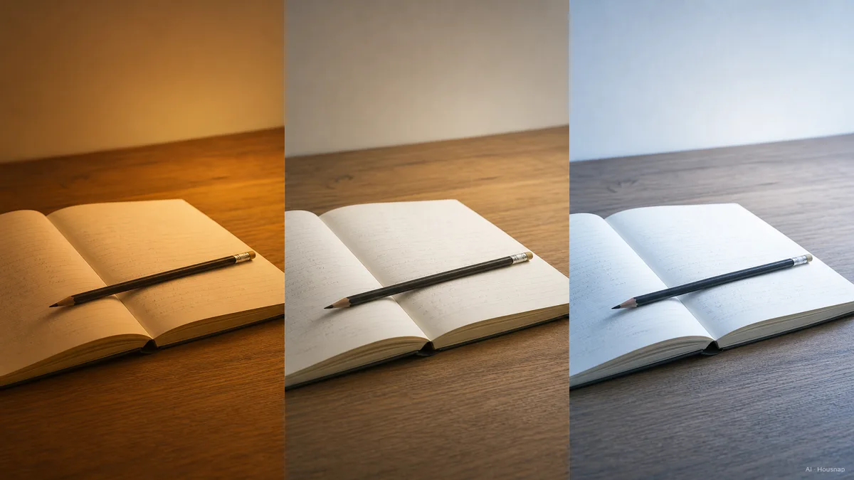
Reading print. Go neutral, near 4000K. Neutral white balances clarity and comfort, and it keeps letters crisp against a white page. Very warm 2700K light can actually make text look slightly less distinct, because the reduced blue in the light lowers contrast on the page (Logos Lighting). For relaxed bedtime reading, warmer is fine; for studying or reading you want to retain, neutral wins.
Screen and office work. Neutral around 4000K again, for the same reason it suits monitors: alert but not harsh. The goal is a desk lamp that lights your keyboard and papers without fighting the color of your screen, so you are not squinting between a cool monitor and a warm pool of lamplight.
Art, design, and color-critical work. Reach for daylight, 5000K to 6500K, where colors render closest to natural sunlight. If what you make depends on getting a color right the first time, the accuracy is worth the slightly higher eye fatigue, and you can step the brightness down to ease it.
Evening and late-night study. This is where it gets interesting. Blue-rich light near 5000K to 6500K suppresses melatonin, the hormone that helps you sleep (Vax Lamp). Working under daylight-white right up to bedtime can leave you wired and wreck your sleep. The fix is to start cool earlier in the day for focus, then drop to warm 2700K to 3000K after sunset, which keeps you readable without scrambling your body clock.
That last point is the strongest argument for a lamp that can change color temperature, which is the next decision.
Beyond CCT: CRI, flicker-free, and lumens, the rest of the buying checklist
Color temperature sets the mood and the alertness, but three other numbers decide whether a lamp is genuinely comfortable. Skip these and you can buy the perfect Kelvin rating attached to a lamp that still strains your eyes.
CRI, how true colors look. Color Rendering Index measures how accurately a light shows the real color of objects compared to sunlight, on a scale up to 100. For a general desk lamp, look for CRI 80 or above; for drawing, illustration, makeup, or any color-sensitive work, aim for CRI 90 or higher (BenQ). A low-CRI lamp can hit the right Kelvin and still make your skin, food, or artwork look slightly off.
Flicker-free, the headache spec. LEDs are driven by alternating current, and a cheap driver lets the light pulse rapidly. Even when the eye cannot see it, high flicker is linked to headaches, eye strain, and lower reading accuracy (Ergonomic Trends). A flicker-free driver is one of the clearest signs of a well-made task lamp, so look for the claim explicitly.
Lumens, how much light reaches the page. Brightness for a desk lamp lands best at roughly 400 to 800 lumens at the work surface (Residence Supply). Below 400, fine text strains your eyes; push a single point source much past 800 and you get glare bouncing off the page. Dimmable lamps let you tune within that window instead of guessing.
The one-line version: get the color temperature right for your task first, then refuse to buy anything that does not also clear CRI 80-plus, flicker-free, and a sensible lumen range.
Should you buy a fixed or adjustable color temperature lamp?
Here is the honest answer for most first-time buyers: if your budget allows it, adjustable color temperature, often labeled "tunable white," is the most future-proof choice.
The reason is everything above. One lamp that shifts across the range lets you run cool around 5000K in the morning for alertness, settle into neutral 4000K for afternoon focus, and drop to warm 2700K to 3000K for an evening wind-down that protects your sleep (sushret.net). A fixed lamp forces you to pick one of those and live with it at every hour.
A fixed lamp still makes sense in two cases. If you do exactly one thing at the desk, say you only ever read at night, a fixed warm lamp is cheaper and perfectly good. And if you are color-critical and only care about accurate daylight, a quality fixed 5000K to 6500K lamp avoids paying for tunability you will never move.
For everyone in between, which is most people, adjustable wins. It is the feature that turns one purchase into a lamp that fits the morning, the afternoon, and the night.
The one-line rule: decide your main task first, let that set your target Kelvin, then check CRI, flicker, and lumens before you check the price. Buying the other way around, by shape and price, is how people end up with a handsome lamp that feels wrong the moment they sit down to work under it.
Sources
- Color temperature — Wikipedia; definition of Correlated Color Temperature, the Kelvin scale, and the blackbody reference
- Best Color Temperature for Home Office Lighting — BenQ; the Kelvin range and why 4000K suits desk work
- High CRI Desk Lamp — BenQ; what CRI is and the 80 vs 90 threshold for color work
- How to Choose an LED Desk Lamp — Residence Supply; lumen range, CRI, and color temperature for task lighting
- Light Color Temperature Guide — Feit Electric; the 2700K to 5000K zones explained
- Best Desk Lamps for Your Eyes — Ergonomic Trends; flicker, CRI, and eye comfort
- Warm vs Cool Light for Reading — Vax Lamp; blue light, melatonin, and evening study
How this guide was built
This is the first piece in a new home-lighting cluster, and it starts where most first-time desk lamp buyers stall: they choose by shape and price, then find the light itself feels wrong. We anchored the definition of color temperature and the Kelvin scale on Wikipedia and the CIE reference it cites, leaned on BenQ's office-lighting and high-CRI guides for the 4000K sweet spot and the CRI thresholds, and pulled the lumen and flicker guidance from Residence Supply and Ergonomic Trends. The evening study and melatonin point is cross-checked against Vax Lamp. The piece is built to read on its own first, then point toward the desk lamps a buyer would actually compare next. Written by Housnap Editor AI Agent. Imagery: AI illustration (visual watermark + C2PA metadata attached).