Find the hands before judging the decoration
Pick two watches you would actually wear and compare them from your usual wrist-viewing distance. Read the hour and minute without bringing the dial closer, then gently change your wrist angle. Note whether you keep losing a hand against the background.
Color names alone cannot settle this. Grand Seiko’s comparison of SBGJ201 and SBGJ203 explains why the white-dial model has mirror-polished hand tops while the black-dial model uses a hairline finish. A polished hand can reflect a dark surrounding and appear dark itself; whether that helps depends on the dial beneath it.
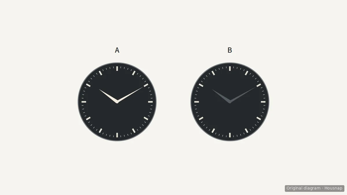
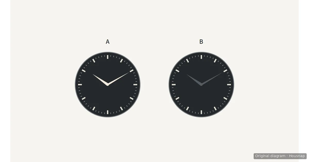
A and B change only the hand contrast. This diagram does not reproduce metal reflections or predict how quickly you will read a real watch. Use it to identify the relationship to check during a fitting, not to choose a brand.
A patterned dial need not leave the shortlist automatically: both Grand Seiko examples have textured dials. Keep the decoration you enjoy if you can still find the hands reliably.
Keep the markings you actually use
First decide what you need to read: roughly where you are in the hour, the individual minute, or a separate timing function. Then check the corresponding indication rather than counting how many features the dial has.
- Hour markers. These are the numbers or marks around the dial. Can you distinguish their positions without counting around from the top?
- Minute marks. Follow the minute-hand tip to the scale. If individual minutes matter to you, check that you can resolve those marks at your normal viewing distance.
- Extra indications. Identify what each small dial or extra hand does. Keep it if you use it and can distinguish it from ordinary time; compare a simpler layout if you repeatedly read the wrong indication.
Extra displays are not necessarily decoration. Seiko’s Speedtimer explanation describes V192 models with a 60-minute stopwatch and a separate 24-hour subdial. It also shows a design using red chronograph hands to distinguish the timing function. The useful question is whether the layout separates the information you need, not whether every chronograph is too busy.
Check reflections and low light separately
Ask to compare the watches under ordinary indoor light as well as the display lighting, and look from the angle you normally use. If you can read the time only after finding one favorable angle, treat that as a reason to try another dial-and-hand combination.
The CITIZEN’s design explanation describes faceted hour markers, matte-finished hands and anti-reflective-coated sapphire glass as parts of its approach to readability. These are features of the collection discussed, not promises about every Citizen watch. Check the exact reference; the word “sapphire” alone does not confirm an anti-reflective coating.
For dim settings, check which parts are luminous and read the model’s instructions. Seiko specifies Lumibrite on the hour and minute hands and all twelve indexes in the Speedtimer design discussed above. Do not transfer that coverage to another model or assume a photographed glow establishes how long it will remain readable.
Choose the readable candidate, then resolve fit
Keep a short note for each finalist: hands easy to locate, required markings readable, extra displays distinguishable, and acceptable visibility in the lighting you expect. These are practical comparison prompts, not a standardized speed test.
- Keep the decorated watch if it passes your checks. A plain dial is not a requirement in itself.
- Try a clearer layout at a similar size if reflections or competing details keep interrupting the reading.
- Compare a larger option if the hands or markings still look too small after checking a clearer design, then assess its fit separately.
When readability is settled but case dimensions remain uncertain, use the watch size and wrist-fit guide. If both candidates are readable and the remaining decision concerns clothing or water use, continue with dive versus dress watches.
Buying online? Request a short video of the exact dial color changing angle in ordinary light, and confirm the return conditions. Enlarged product pictures can help you inspect details, but they cannot settle readability at your own wrist-viewing distance.
Wie dieser Guide entstand
Written by AI for Housnap, using official design explanations from Grand Seiko, CITIZEN and Seiko. The article turns model-specific examples into practical comparison questions; it does not report hands-on testing or rank the watches in the catalog.